
I’m Hideto Ueno, a fourth-year student at the University of Tokyo Association Football Club. In this article, I would like to introduce you to our football analysis using various data, done by our “Technical Unit” (analysis team).
The latest article about data analysis is here. ↓↓
Contents
The relationship between modern football and data analysis
In recent years, we hear the term “data scientist” a lot. The rise of machine learning theory and technology has made this profession particularly popular, but it is also a sign that society is becoming more respectful of mathematically and statistically supported decision making.
The football industry is no exception to this trend.
Europe’s leading data analysts supporting the strong Pep’s Man City
Quantum mechanics is changing football! The brains behind Liverpool F.C. ” The Laptop Guys “.
J-league teams, as well as Manchester City, Liverpool, and other top teams in the world, have been using wearable devices to collect tracking data. As mentioned in the article above, it is natural for top teams to hire data analysts from academia, especially those with a background in mathematics.
I personally think that data companies like Opta and Hudl, which are part of the “sports tech” industry, will grow in the future.
From this season, the rules of the University Football Federation of Tokyo, to which our club belongs, have been revised. Bringing communication devices to the bench was previously prohibited, but by the revision, the ban has been lifted making it possible (in theory) to provide feedback using video from outside in real time. However, it is true that there is a big gap between “theoretically possible” and “practicable”. In order to bridge this gap, the technical team of our club is working with several laboratories and groups to develop the basic technology and to implement it in society by testing it in the daily practice and in games.
Data collection at the University of Tokyo Association Football Club
In order to analyze the data, we need to collect the data. This year, we are collecting data in the following ways.
Tagging our games using Hudl
https://www.hudl.com/
This year our team has signed up to Hudl Assist, a tagging software and service that does the tagging for us. We can tag possession, passing, shooting, etc. as shown below.
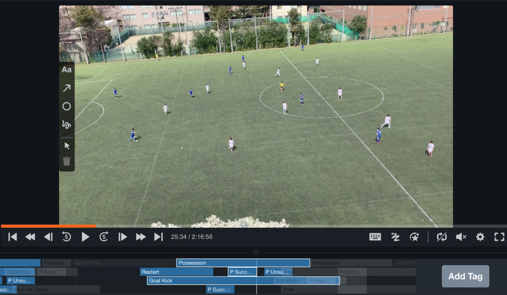
After the match, we send the video of the match to Hudl Assist and they will return it to us with the tags a few hours later.
In the past, it was difficult to get data immediately after a game, so it took time to provide feedback, but this year we can provide data to coaches and alumni coaches promptly. The UI/UX is easy to use, and I highly recommend it. I also think it’s great that the technology used in the service is very modern.
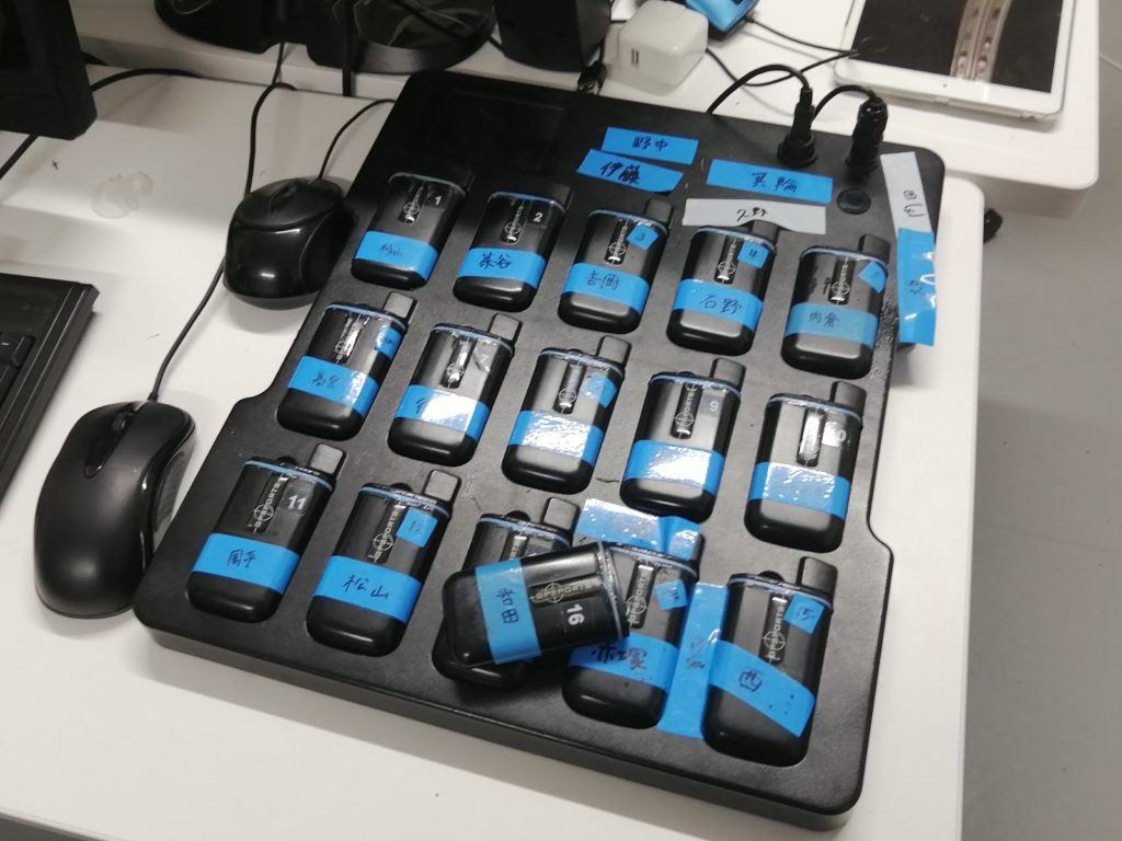
GPS tracking data and heart rate by Catapult
This is an attempt we started last year, and we are using wearable devices to measure coordinates and heart rate during games and practices. We can get a time series of absolute values of acceleration, coordinates, and heart rate measured five times per second.
By doing these things, we can get about 30MB of data per match, which is just the GPS data in addition to the video. This amount of data can be viewed as either too much or too little. In other words, this is too much data for humans to understand by hand, and it needs to be handled through some kind of information processing.
On the other hand, compared to companies like Opta and Data Stadium, we have a very small amount of data. For example, we only have about 100 samples of successful and unsuccessful shots, while these companies have samples in the order of hundreds of thousands. The difficulty is that we need to think of useful feedback within such a small amount of data.
Data visualization and analysis at the University of Tokyo Association Football Club
The data from Hudl and Catapult can be divided into three main categories: tags, coordinates, and heart rate. First, the technical team is making a simple graph to show these data to the players and coaches. This is the first step.
Graphs
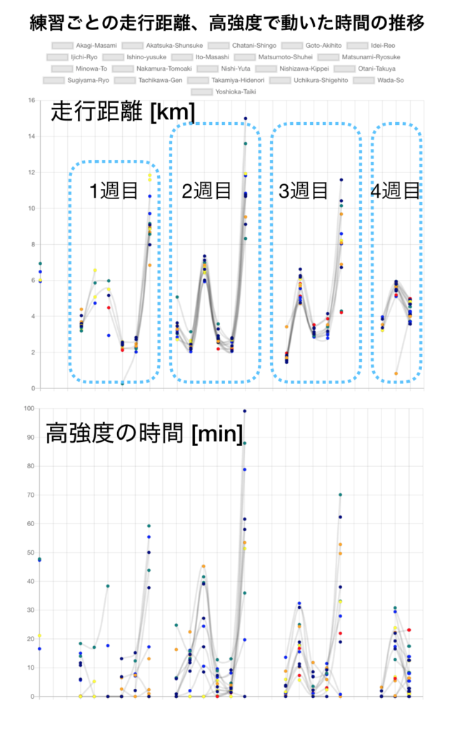
We make various graphs, for example, this one below has the date on the horizontal axis and the distance traveled and the time of high intensity exercise on the vertical axis for each practice. The heart rate is not clear because it has noise in it, but you can see that there is a certain pattern for the distance traveled each week.
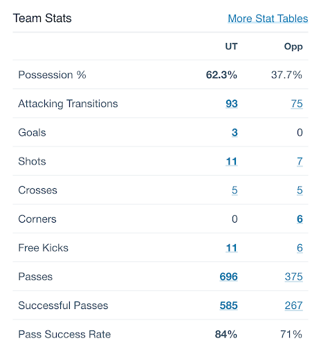
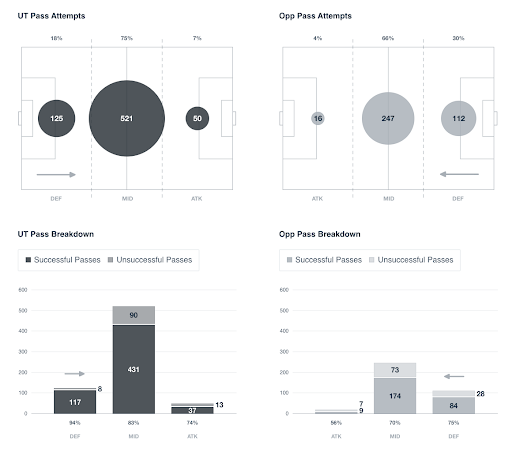
Also, just plotting the stats obtained from Hudl can be interesting.
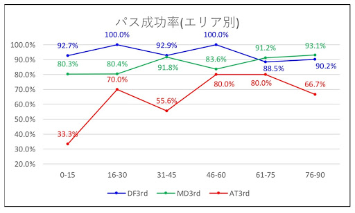
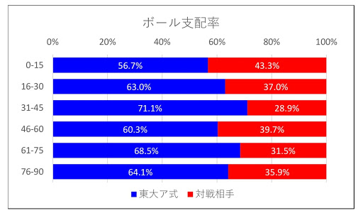
The data shown above can be compared to the public data of the J-League.
The next step is to process the raw data to extract the features. Here are some examples of what can be calculated now.
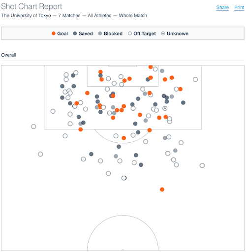
xG
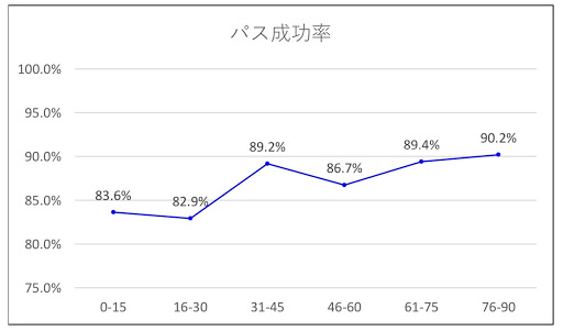
From this year, we have been calculating the “xG” (expected goal value) for each shot. This is the probability that the shot will go into the goal, and by accumulating it, when it goes up to 1, it represents the state of the game where (normally) a goal is possible. By breaking down the notion that these are essentially discrete numbers, we are able to characterize the flow of the game at a finer granularity. The following is the xG of a 45×3 practice game.
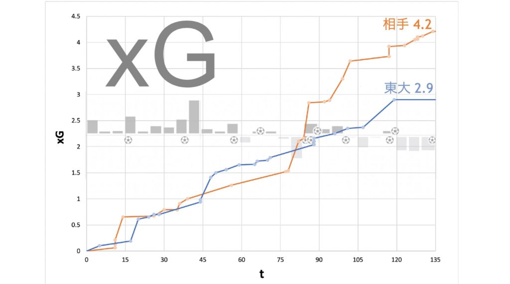
For example, this could mean that we can
- show players that we should have scored n goals at this time.
- calculate the time of day when the flow of the game changed dramatically.
In the example above, we lost a lot of goals between 75 and 90, and the xG value was also reversed.
Nowadays, there is a lot of research that considers the expected value of a goal for each phase of the game, and I would like to aim for such a thing in our team in the future.
Heat map
This is a common way of visualization these days, and our team can calculate it as well. We are just putting the coordinate information from Cataplut, but by using the Hudl tag information as well as the heat map of the whole match, we can create a map with narrowed down conditions. (It is a little tiring to write down the start and end times of the tags by hand though…)
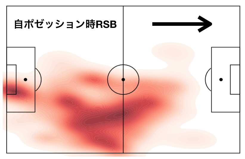
This is a heat map of the RSB, during our possession in a previous practice game. It clearly shows the characteristics of the RSB going in and playing an inverted SB. We plan to use this kind of heat map to visually measure the degree of achievement when variable formations are adopted.
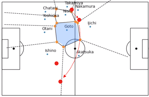
Voronoi Diagram
This is a common diagram that shows the area where the player is closest to the particular point. This can be used to help you evaluate your defense. In other words, when an opponent enters that area, the person who can respond the fastest is that person closest to the point. For example, this is the situation in a practice game where a decision was made. He was dropped from the right WB to the anchor, then the ball changed to the left, and opponent kicked free in front of the goal from a cross.
23-second~ of the video above shows the phase when the WB was dropped to the anchor. The orange dots indicate the area where the player is closest. You can see that the area of Goto, the right CH, has become very large. At the same time, the anchor was taken out of the equal position by about 4 players of our team. Goto could not come out strongly because he had to worry about the left IH of the opponent, so he was deployed widely in the opposite direction. In this phase, the FW should have cut off the pass course to the CB and defended in a position where FW could aim when he entered the anchor position.

Analysis
After displaying these charts and diagrams, we can actually give feedback on what we notice from the indicators. Currently, there are many cases where we can’t get to the feedback stage, but we need to keep in mind that unless we do this well, it will be nothing more than self-satisfaction. The off-season is still going to continue, but especially during the season, I want to increase the frequency and quality of my feedback and make it a goal to create positive information for the team.
example:
Our tasks
I have written about our current situation for a long time, but there are still many issues that need to be addressed before we can put it into practical use.
What we can currently do is mainly to test (fairly) classical statistical methods, so our future task is to conduct analysis using more advanced techniques and theories in the mid- to long-term plan. I would be happy if I could reduce various time series data to lower-order features, so that I can think of “phase search” and “phase evaluation values.
In addition, I need to tidy up the diagrams and other data that are now available, since the code used for prototyping is scattered all over the place and it has become difficult to put it all together. In fact, there is a lot of pre-processing that needs to be done to the obtained data, and it requires a lot of hard work (converting latitude and longitude to field coordinates, processing of substitute players, problems with heartbeats not being captured, time differences between video and GPS…). I would like to be able to do this a little better.
Fundamentally, it is difficult to get the coordinates of the opposing team and the ball, so there is a lot of analysis that cannot be done. If you know the position of the opponent and the ball, you can expand the scope of your analysis to include which spaces to use when attacking. To solve this problem, we are working with a company called Glaucs, which is developing technology to infer the positions of both your team and the opposing team.
Conclusion
Now, the University of Tokyo Association Football Club is also looking for people who want to learn and analyze football from the aspects I’ve mentioned so far. Needless to say, as you can see in my previous article (CL City x Madrid Review), you can also learn how to watch soccer, so if you like watching soccer, I think being a technical staff member is the perfect place for you!
Also, there are many ways to get involved, so if you are not a member of the club but want to study soccer data or want data, we can provide it, so please contact us.
If you like soccer and want to get in touch with data, please come and talk to us!
Tweet