
Contents
Introduction
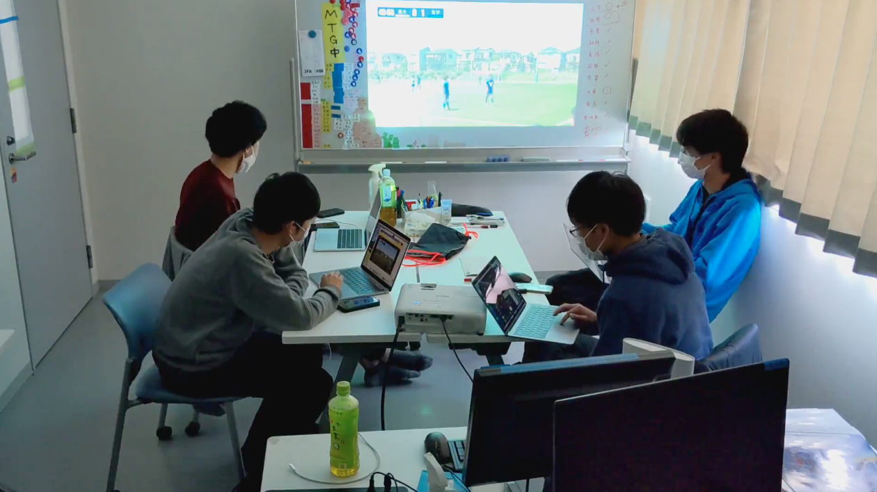
I’m Kinoshita, a new third-year student who has been working as the head of data analysis in the Technical Unit of the University of Tokyo’s Ashikaga Kickball Club since this season. The Technical Unit is one of the units that supports players in various ways from off the pitch, rather than actually being on the pitch as a player. The activities of the technical unit include: thoroughly analyzing the tactics and individual characteristics of opponents, holding meetings with coaches such as managers and alumni coaches to determine how to play the game, and providing feedback to players on their performance after actual matches to help them grow. I also give feedback to the players on their performance and help them grow.
The basis of these activities is the large amount of data obtained from daily practice and matches. Professional clubs in Europe, which are at the forefront of the world, are actively using data for analysis, as their data collection technology and analysis methods have evolved dramatically in recent years, and they have the financial resources to obtain data if they wish. They are willing to invest and bring in the best data scientists to the club and they are taking the club to new heights.
Of course, the team is just a university club and an amateur club. However, that does not mean that we should give up from the beginning. To date, our Technical Unit has established our own methodology to make the most of limited data in order to become “the best sports analytics group in Japan”. In this article, I have written about almost all of our data analysis efforts. I hope you will read this article to the end, as it is very rich in content.
Data collection – Use of software and devices
The cycle of data analysis in the A formula can be divided into three main parts. These are data collection, data calculation and visualization, and feedback. First, let me explain how A-Shiki collects data.
Tagging of matches using Hudl
We are currently using Hudl, a software program that allows us to tag matches. By attaching tags such as shooting, passing, possession, transition, etc. to the game footage, it is possible to review only the scenes with the specified tags.
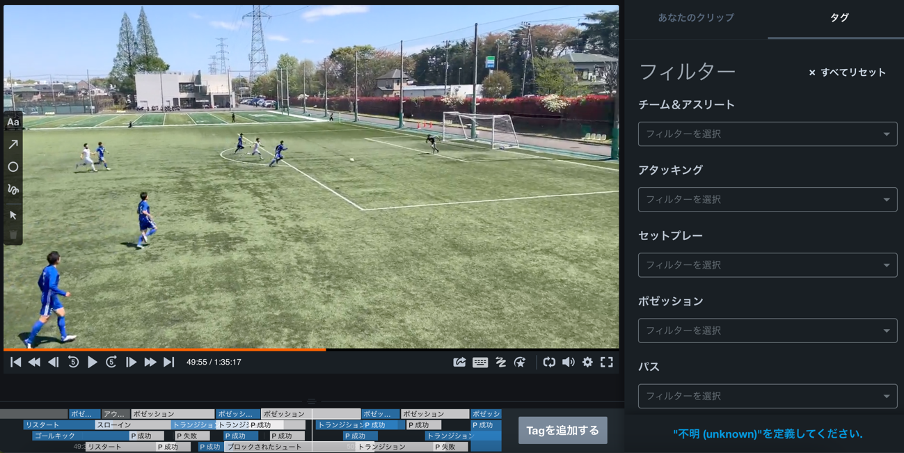
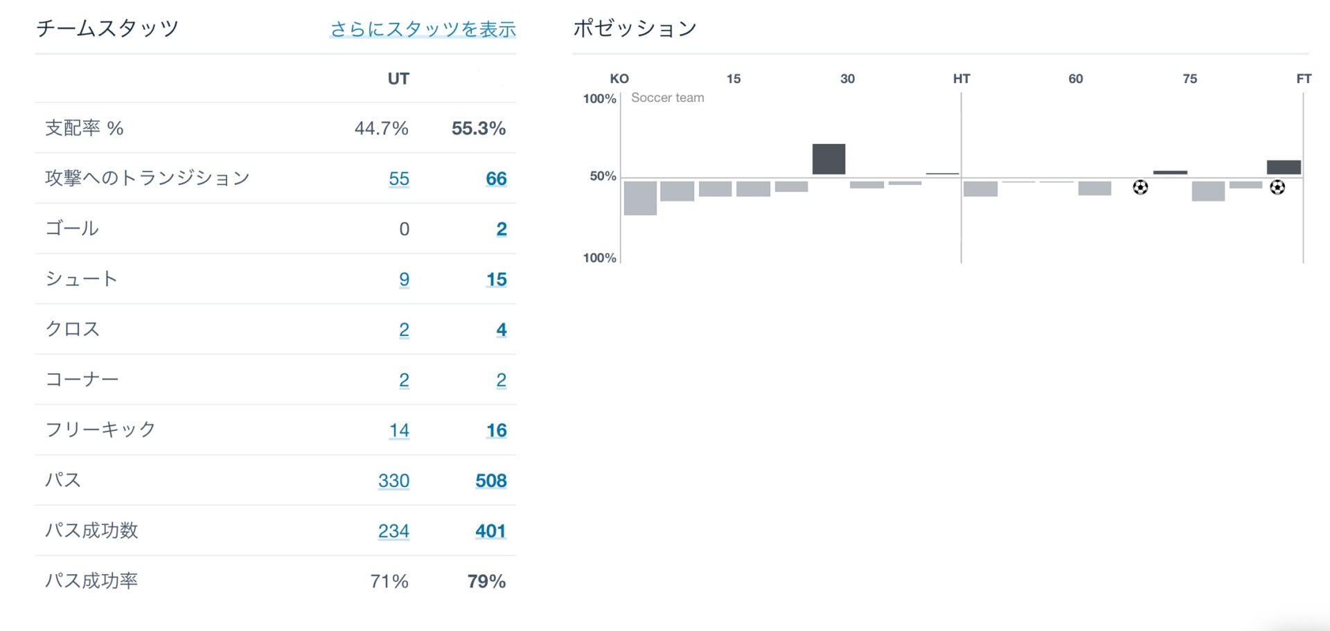
In addition to this, we have signed a contract with a service called Hudl Assist, which allows you to send in footage and have it tagged and returned to you a few hours later. This will allow you to see a report of each stat (by time period), such as number of passes, possession, shots and shot position, as well as goals and assists.

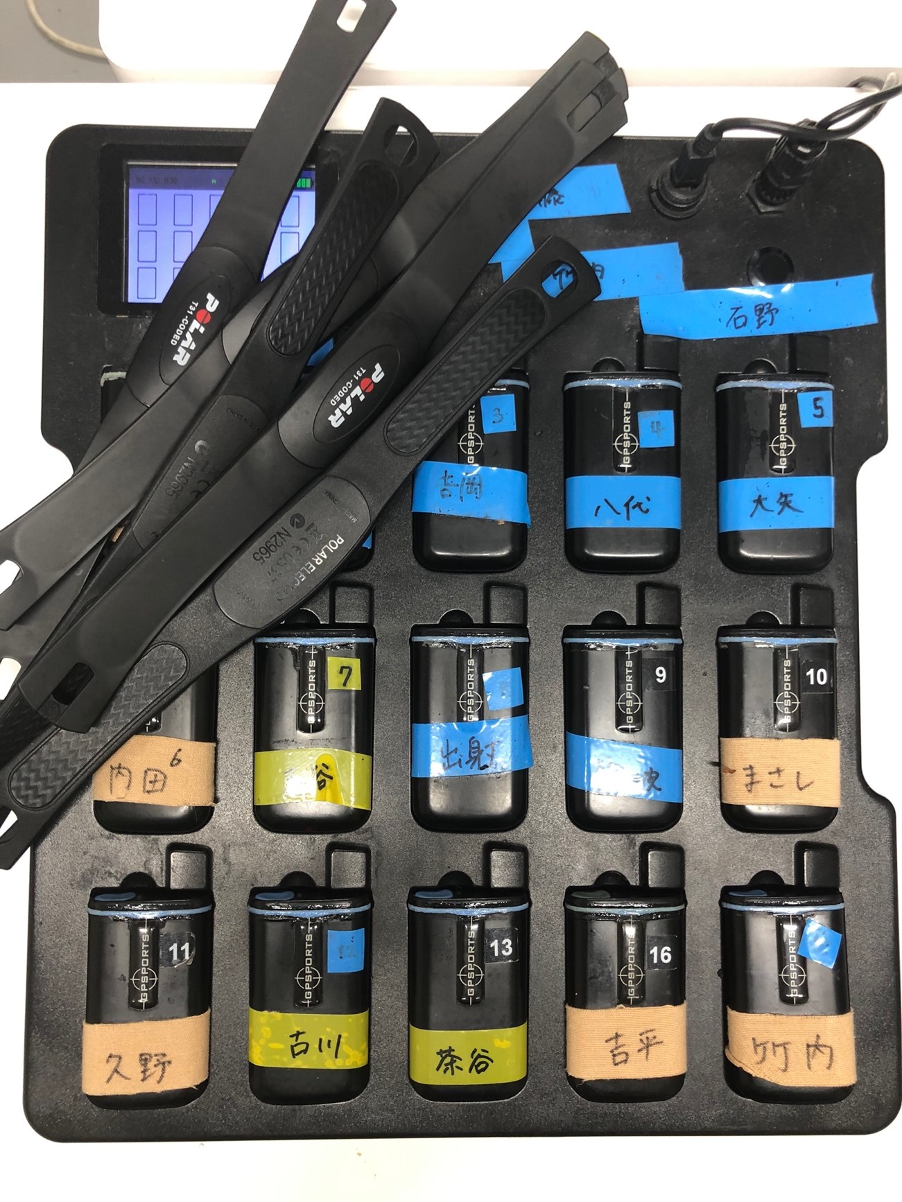
Tracking data by Catapult
Catapult is a so-called GPS device. Players wear it on their bodies during practice or games, and it provides tracking data every 0.2 seconds. Specifically, there are three main types of data: location information expressed in latitude and longitude, speed, and heart rate. After practice or a game, I connect to my computer and upload the resulting database file with the extension DB3 to Google Drive, which is shared by the department. However, the database file as it is cannot be provided to the coaches in a form that is easy to understand the contents of the data, so it is necessary to process and visualize the data as described below.
Real-time tagging using FL-UX
We have been using the above two software since last season, but we are now introducing FL-UX, which allows us to tag video in real time, whereas Hudl allows us to tag after the game. For example, you can watch the first half of a game and tag the scenes that interest you, and then show those scenes to the coaches at halftime. Video editing is also made easy, and it looks like it will be very useful in the future, but we will have to find out how to use this software in a concrete way. However, we have already started working on real-time analysis of matches, and we can send match videos live to the analysis room in the club room, where the analysis of multiple technical staff members can be fed back to the bench remotely.
Other manual tally
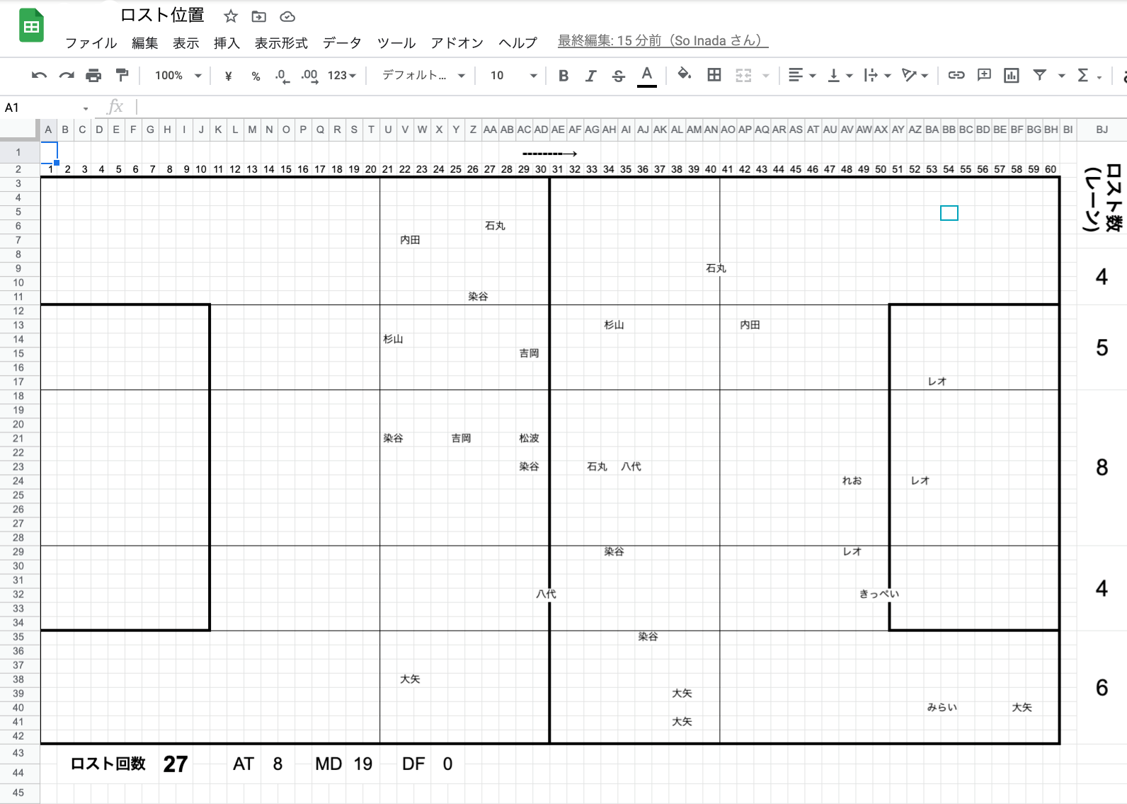
Although these software programs certainly make data collection easier, there is still a lack of data to analyze soccer data. Fortunately, thanks to the efforts of our seniors, the Technical Unit of the University of Tokyo Association Football Club has been able to gradually become recognized by the freshmen who have been accepted to the University of Tokyo, and now has about 15 members. The team members are divided into three groups, and by reviewing the matches, they manually collect information such as who passed the ball to whom, in which area the ball was lost, and from which area the ball penetrated (or was allowed to penetrate). The data collected will not only be used for feedback on each game, but will also be flexible according to the needs of the coaches and players at the time. Hudl’s tags are also very useful when reviewing the games.
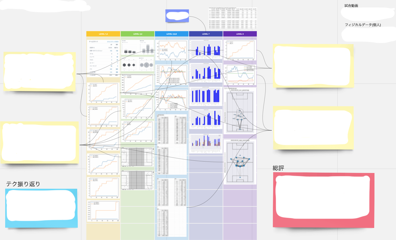
Data calculation and visualization – Operation of automated systems
For example, the stats obtained from Hudl can be used for feedback to some extent just by collecting data, but the quality of feedback can be improved by processing the data and calculating higher-order data. This requires a certain amount of programming skills, but this is where our Technical Unit can show its skills.
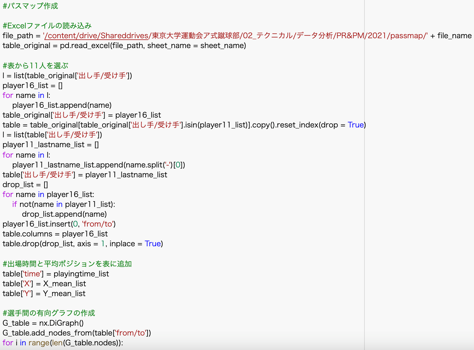
It is also important to “share” and “automate” these tasks. Up until last season, we were able to calculate the data, but the code we wrote was scattered all over the place and could not be shared with other technical staff, and the pre-processing, such as processing missing values, was done by hand each time, making the work too dependent on specific individuals. This season, in order to improve these points, we used Google Colaboratory (a free service that allows you to write and execute Python, a programming language, from a browser without the need to build an environment) to create a system that allows anyone to calculate and visualize data as much as possible, and to complete these tasks automatically as much as possible. We have coded the data in such a way that anyone can calculate and visualize the data as much as possible, and as much as possible, we can complete these tasks automatically, and we are already operating the automated system for some of the data introduced below.
xG and PPDA
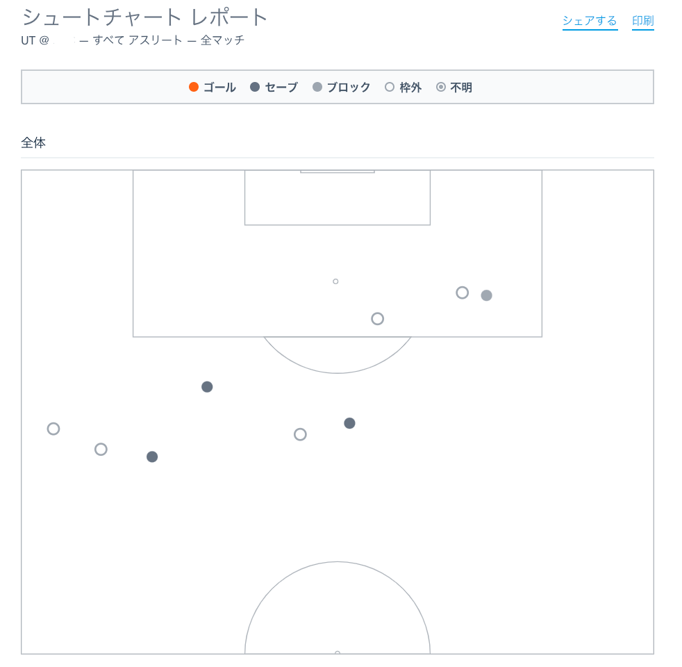
I will introduce xG and PPDA as higher-order indicators that can be calculated mainly from Hudl. xG, as those who are familiar with soccer may know, is the “expected goal value. By calculating the probability of scoring a goal based on the position of the shot, the position of the surrounding defenders, etc., and accumulating the total, you can recognize the gap between the ideal and the reality, such as “I should have scored n goals” or “I should have scored m goals, but I was able to keep the game scoreless. You can also derive the time period when the flow of the game changed dramatically. This means that goals can be interpreted as continuous numbers.
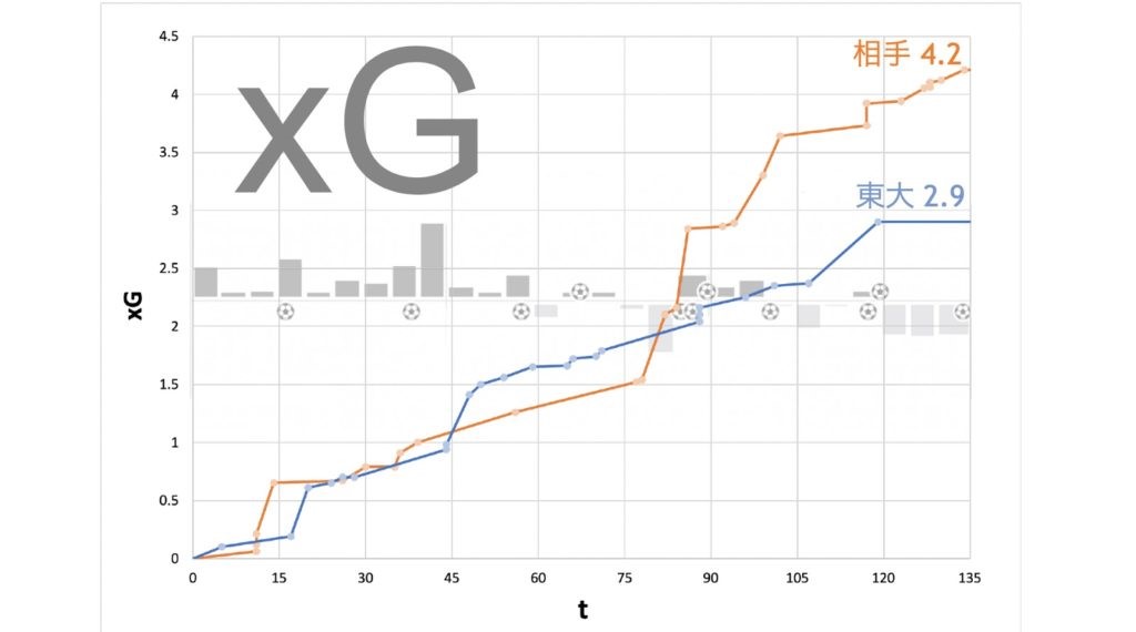
This is the xG of a practice match (3 x 45 minutes), and you can see that the opponent took control of the match after the 75th to 90th minute. In the formula, we can get the data of the position and time of the shot by Hudl, so we can calculate the xG in a simplified version.
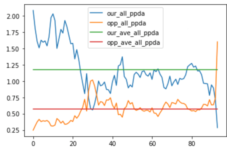
Another thing I would like to introduce is PPDA. This stands for “Passes Allowed Per Defensive Actions,” and is an indicator obtained by dividing the number of passes allowed to the opposing team by the number of defensive actions taken by us. Using Hudl’s tags for transitions, fouls, shot blocks, out of play, etc., it is also possible to calculate a pseudo-A formula PPDA (both xG and PPDA). The PPDA can also be calculated using Hudl’s tags for transitions, fouls, shot blocks, out-of-play, etc. (Both xG and PPDA require manual tabulation of tag times, which is a bit of work).
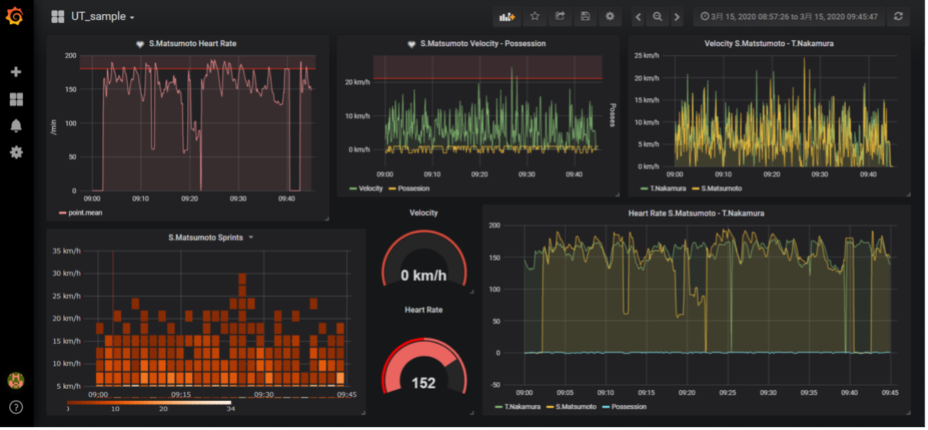
Physical data
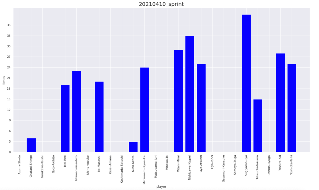
By processing the speed and heart rate obtained from Catapult, various physical data can be calculated. The first thing that comes to mind is the distance traveled. This can be easily obtained by integrating the speed with time. Conversely, acceleration can also be calculated by differentiating the speed with time. Furthermore, if you write a code that counts the number of times you sprint by defining that a sprint is one if you sustain a speed of v kilometers per hour or more for t seconds, you can also obtain the number of sprints.
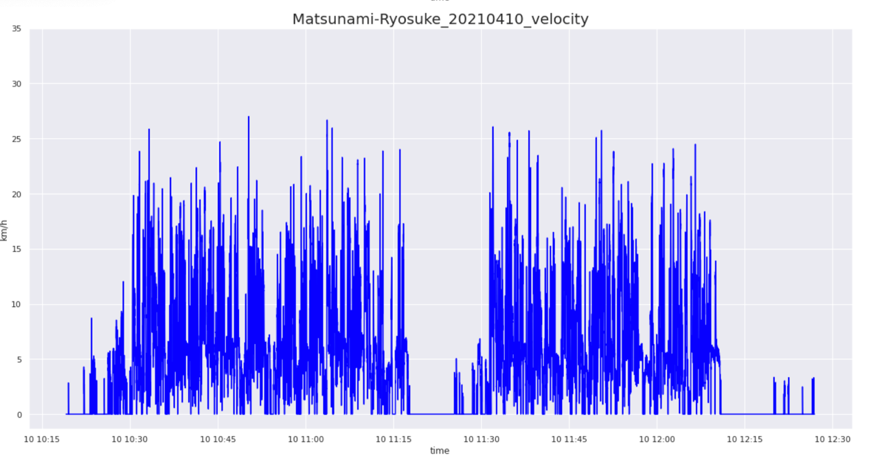
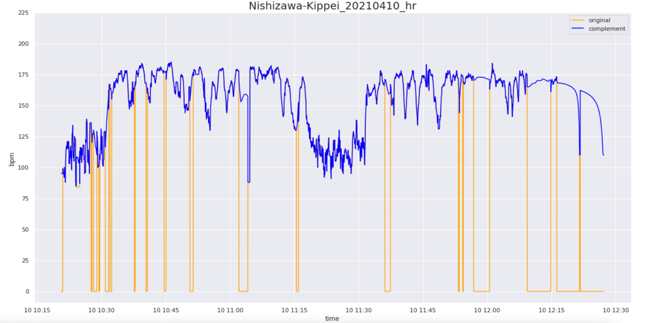
Heartbeats are a little problematic because the player moves so much during the game that the device shifts from the chest position and contains missing values. However, when there are few missing values, we try to produce more reliable data by applying moving averages and other complementary methods. We have also tried modeling using other indices that can be explanatory variables for the heart rate, and complementing them by predicting the heart rate, but at present, we have not been able to create a highly accurate model. From this heart rate, we have produced an index called heart rate load, which measures the load on the cardiopulmonary function by weighting each percentage of the maximum heart rate and integrating it over time. In addition, we have a questionnaire that asks players to self-evaluate their subjective level of fatigue after each day’s practice, and we share the results in a bot format (automated). The level of reliability is unknown. The degree of reliability is unknown, and I would like to study it by reading books and papers in the future.
These physical data are mainly used to adjust the practice load in order to improve the physicality of the players and prevent injuries, in cooperation with the physical unit staff. Feedback is also given to individual players as needed, to give them a sense of purpose using numbers (e.g., let’s try to exceed n number of sprints in the next game).
Currently, we have completed and are operating an automated system in which DB3 files uploaded to Google Drive can be read in Google Colaboratory, and by entering the date, the physical data of all players for that day’s practice or game can be displayed, and by entering the player’s name, the physical data of that player can be displayed in chronological order.
Packing rate and path map
In simple terms, the packing rate is a measure of how many opponents a player can pass over with a single pass. This allows you to evaluate how effective each player was in passing the ball (i.e., whether they were able to receive the pass in an effective position).
For example, in the image above, a single pass over three opponents is worth 3 points (if the receiver of the pass does not look forward, the weight is changed to 3 x 0.2 = 0.6 points). For example, even if you pass a lot, it is difficult to say that you are effective if you are only passing outside the opponent’s defensive block, so this indicator is useful in that it allows you to take this into account. Passes are tallied by hand, but the calculation of scores is done automatically as much as possible using a simple Google spreadsheet template.
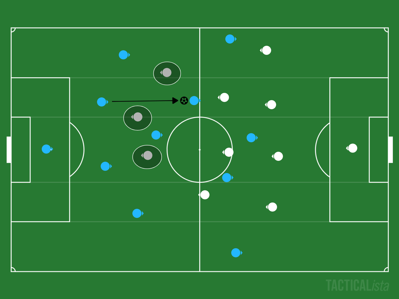
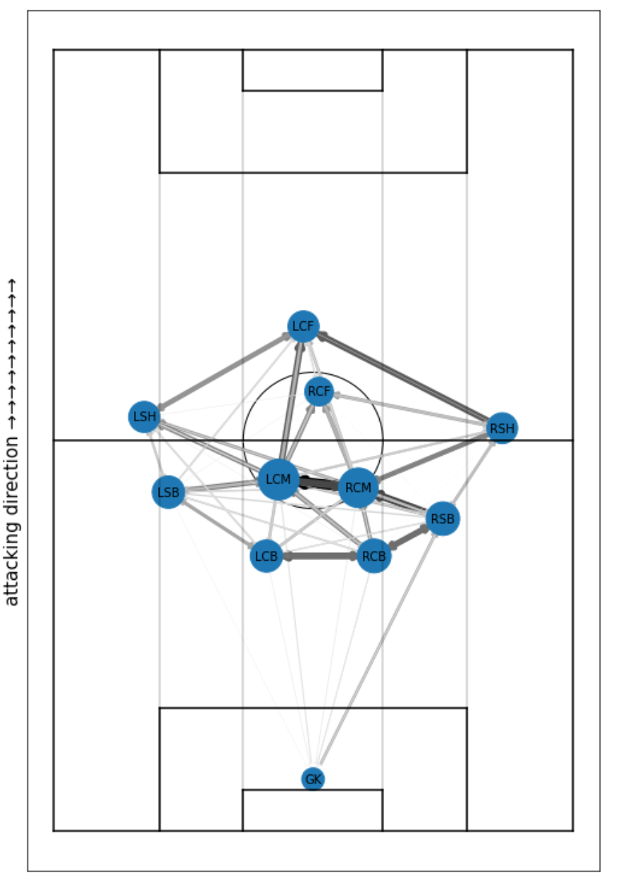
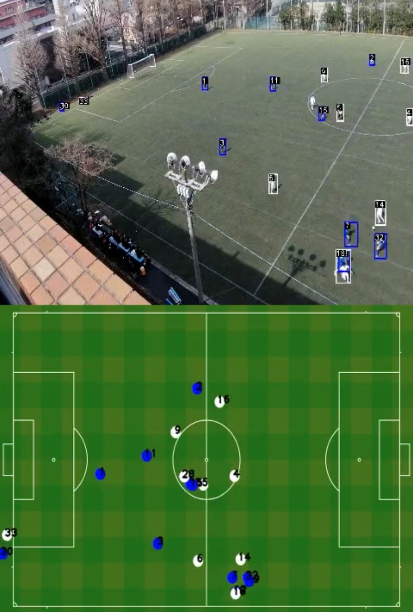
I have explained a lot of data and indicators so far, but the one I would like to introduce most is the path map. This is a graph theory (network diagram) representation of the behavior of the target team in a single game, and the following is the actual data site used for professional games.
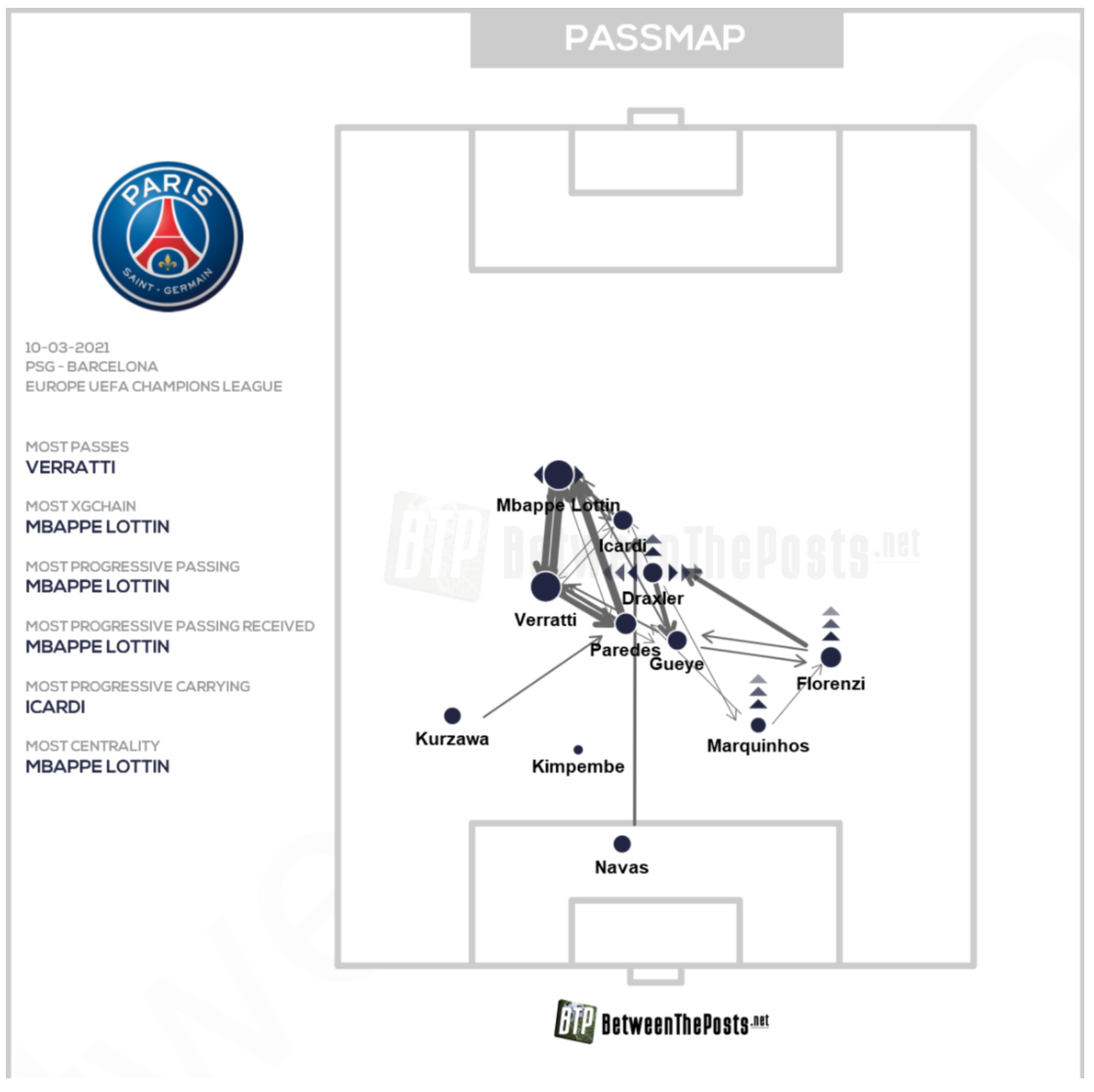
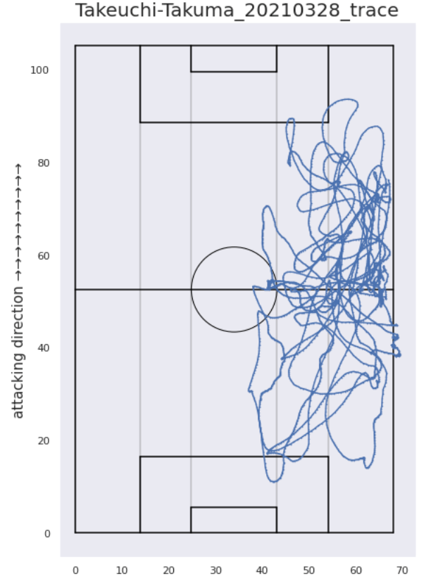
The position of a player’s circle (node) indicates his average position in the match, the size of the circle indicates how many passes he was involved in, and the thickness and density of the arrow (edge) indicates how many passes were exchanged between the players. This can be created by combining the number of passes collected in the process of calculating the packing rate with the location information from Catapult. Then, by rotating the coordinates so that the direction of the pitch and the direction of the coordinate axis are aligned, the trajectory of the player’s movement can be projected onto the pitch as shown below. If we take the average of these trajectories, we can calculate the average position. However, water supply and halftime times had to be removed as noise, and this part of the coding was very difficult. It can also be applied to calculate heat maps and Voronoi diagrams.
After calculating the average position, we just need to adjust the size and density of the circles and arrows according to the number of paths aggregated, and the plot is complete. I was able to automate the entire process of displaying the path map on Google Colaboratory, including loading the aggregated file and connecting it to the Catapult data. As a matter of fact, we hurriedly completed it in time for this article and the start of the league, so full-scale operation will be done in the future. It can also be displayed by time zone, so we can see at a glance whether we were attacking or being attacked, what kind of positioning (tactics) we used, who was playing the central role in connecting passes, and where we were making progress. In addition, although positional information is not available, it can be used to analyze the tactics of the opposing team.
Feedback – Report writing
As you can see, A-Shiki has succeeded in calculating and visualizing a variety of data through the use of multiple software programs and programming techniques, but it is safe to say that we cannot rely on data alone to see the essence of a match. We recognize that data is only used to objectively support and reinforce the analysis of a match that is done by looking at it with the naked eye, and to make use of it in the decision-making process that follows. For this reason, feedback requires the ability to organize and integrate a variety of data, identify issues by observing the game with the naked eye, and then, if necessary, correctly select and present data from the integrated data that is useful for objective support. Until now, we have calculated data discretely and provided feedback for each of them, but this sometimes ended up in “just providing data. We are currently working on creating a framework and report templates that will facilitate the feedback process that should be done as described above, and maximize these capabilities.
There is a story that compares data analysis to cooking. The data are the ingredients, we in the technical unit are the cooks, and the coaches and players are the customers. The chef needs to process the ingredients and “make it into an attractive dish”. The key points are these.
- It must have nutrition (content)
- Delicious (with attractive analysis)
- The presentation must be beautiful (easy to understand at a glance)
- Ingredients must have a shelf life (output must be delivered in a timely manner).
These are just a few examples. Based on these stories, the Technical Unit would like to focus on the design of data, and we are trying to visualize the data using Grafana, a free data visualization software.
Relationships with companies and university laboratories
Being a member of the Technical Unit also allows us to get involved with outside companies and university laboratories. In fact, we have been meeting with one major company since last summer to develop joint data analysis techniques and share ideas. They also introduced us to the idea of path maps and Grafana. Currently, it is difficult to obtain information on the positions of the opposing players and the ball, which limits the scope of data analysis. For this reason, we are collaborating with a company called Glaucs, which is developing a technology to estimate location information from captured images using image recognition technology. On the other hand, we considered introducing drones to improve the quality of photography, but the university refused to give us permission due to its location in an urban area.
In addition, we recently announced the official conclusion of a sponsorship agreement with Accenture, the first of its kind in our department, and we have regular meetings with them to give us guidance on what we should do in the future to bridge the gap between our ideals and reality as an organization.
Some of the members of the Technical Unit are developing analytical devices in collaboration with university laboratories. The Technical Unit intends to support the activities of these individual members as well.
Conclusion
In case you were wondering, this was supposed to be a new article for freshmen, but perhaps it was a bit of a difficult topic. I hope this article will be read not only by freshmen, but also by students of other universities who are actually doing data analysis of soccer, junior and senior high school students who want to do something like this in the future, professional analysts, and many more people. Incidentally, I had no programming skills at all when I first entered university, and I actually started studying programming just a year before I started thinking about becoming a data scientist in the future. If you have a strong love for soccer or an enthusiasm for working with data, the upperclassmen will be happy to teach you. We also welcome undergraduates who already have the skills and are willing to be immediately involved in data analysis. I would be happy if you could come and talk to us!
Thank you for reading to the end!